DESIGNS
Branding
Logos and product designs for startup brands
Continental Herbs™
Logo, tagline, product naming, and product design for Continental Herbs™, a startup cannabis brand. In progress + coming soon.
Goals:
Per the founder: bringing the classic, vintage cigarette style into the modern-day world of cannabis. Simplicity at its core, but still eye-catching.
Incorporating international / worldwide strains for diversity.
No tricks, no hidden crazy THC count. These products do exactly as advertised. Options for the newbies, lightweights, and veteran smokers alike.
Logo:
I decided on a simple ‘C’ in the style of a vintage script. That is, to implement the ‘classic’ style of the early 20th century and prior. With strains coming from different countries (continents, really), this font also reminds us of travelers from the Middle Ages.
Blue + yellow for the only 2 things that touch all continents (yes, even Antarctica) and represent easy breezy good vibes: oceans and sunlight.
Made in Canva
Slogan:
Building off of the goal to make a cannabis brand that’s classic, simple, and diverse, “Simple Highs for Simple Travelers” is the true heart of the brand. The exact high that the consumer is looking for. “Travelers”: a play on words based on that particular floating feeling that can only come from quality cannabis.
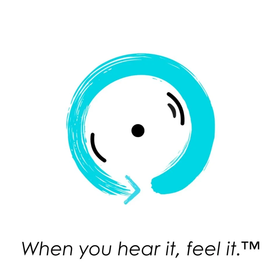
Healyn Audio™
Logo + tagline for a startup audio technology brand, Healyn Audio™. In progress + coming soon.
Goals:
Where premium sound meets mental wellbeing, Healyn Audio’s primary goal is to make products where the audio is so good that it takes the listener to another place.
Products that Healyn + its subsidiaries will provide include: music streaming app, music production tools + software, audio technology, meditation app, and musical instrument accessories.
Emphasis on mental, emotional, and physical wellbeing.
Proceeds from each purchase will go to charities that promote healing in the world, whether that’s mentally, physically, or for the earth.
Logo:
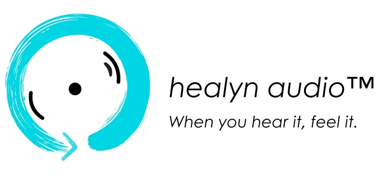
The Zen circle (ensō) in Zen Buddhism represents many things, including the cycle of nature, freedom / enlightenment, presence, creation, the beauty of imperfection, and more. All of these are connected to inner healing, one of the primary company values. That’s why I chose this symbol as the basis of the logo.
The arrow alludes to the common ‘replay’ button, representing continuous music and sound.
The circumpunct (☉) also has many meanings, such as the Sun, oneness, divinity and the soul, and “the Ego and the Self” (per Carl Jung, as explained by Rick Rubin in The Creative Act). I incorporated this symbol into the logo to signify the personal, meditative experience of presence and finding oneself that can come from getting lost in music and audio.
3 ‘sound’ lines: the listener, the artist / speaker, and the audio being listened to. These lines give the impression of sound, making the logo look like a speaker or vinyl record.
Blue: Calmness, peace, inspiration, and creativity—all of which are Healyn’s goals.
Slogan:
“When you hear it, feel it” reminds us to allow what we’re listening to to move us, heal us, and keep us present. It encourages consumers to truly dive into their audio, and promises them that the high quality of Healyn products will inspire them to.
Marketing Concepts
Advertising concepts
iPhone ad concept created from scratch with original photography. Made with Adobe Lightroom + Adobe Illustrator.
Bubly ad concept created from scratch with original photography. Made with Adobe Lightroom + Adobe Illustrator.
Red Bull ad concept created from scratch.
Fender Black Friday ad concept created from scratch. Made with Adobe Lightroom + Adobe Illustrator.
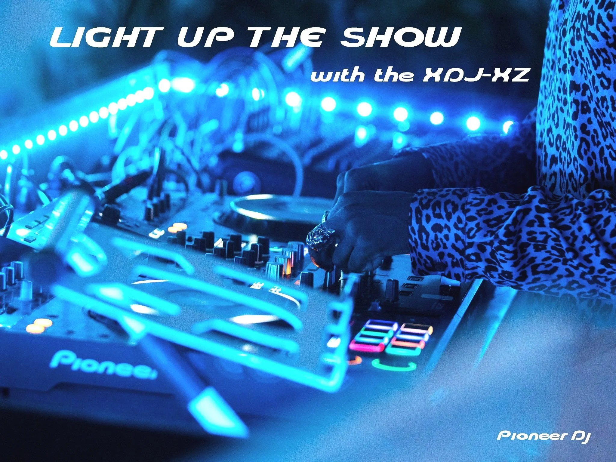
Pioneer DJ XDJ-XZ ad concept created from scratch with original photography. Made with Adobe Lightroom + Adobe Illustrator.
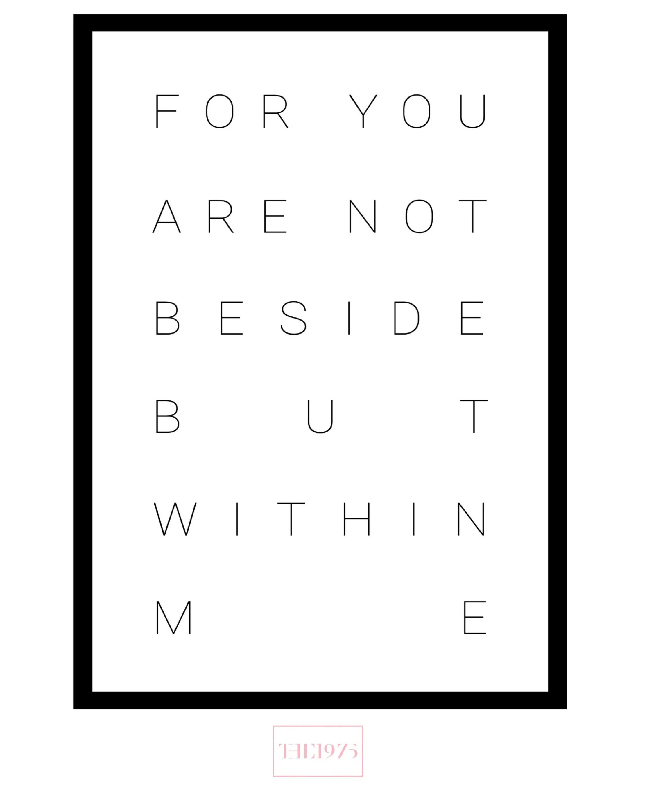
The 1975 promo concept created from scratch using official lyrics from the band's song "Loving Someone." Made with Adobe Illustrator.
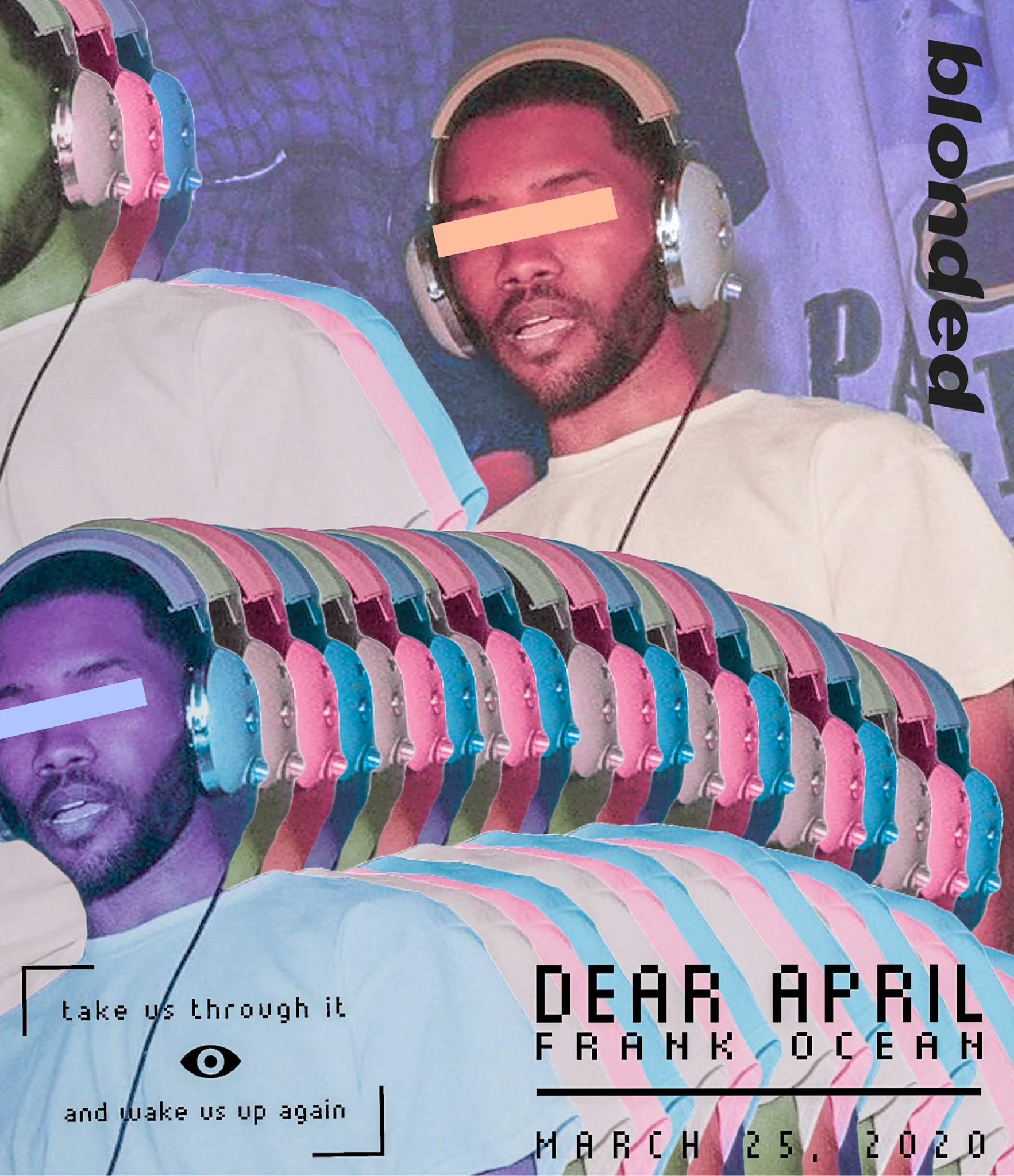
Frank Ocean "Dear April" promo concept created from scratch. Made with Adobe Lightroom + Adobe Illustrator.
Spider-Man 2 video game ad concept created from scratch. Made with Adobe Photoshop + Adobe After Effects. Includes handmade clouds in the shapes of the iconic Playstation buttons. See 'em?
UX/UI Design
Creative development and management of web designs.
Click each site below to view.
Original Artwork
Other artwork + designs

